System-Led UI Redesign of Bishops’ Consumer Website Using Atomic Design
Client
Bishops Cuts/Color
Role
UX/UI Designer
Team
Graphic Designer, Front End Developer, Brand Leadership
Timeline
6 weeks
Framing the challenge: Bishops needed a new look and a flexible system
Bishops wanted a visual refresh to better reflect a broader audience and to support internal teams with a scalable, developer-friendly UI system. Each franchise needed flexibility for local services and pricing, but the platform lacked structure.
My role was to lead the system design, build a reusable UI framework, and ensure handoff was clear and dev-ready.
I led the UI redesign and built the foundational design system
I led the UI redesign and built the foundational design system
I led the UI redesign and built the foundational design system
As the sole designer, I translated the refreshed brand into a responsive interface and token-based system.
Responsibilities
Audited the existing site for structure, audience appeal, clarity, and accessibility
Redesigned key pages to improve visual tone
Built a component system with defined tokens for color, type, spacing, and interactions
Aligned with brand and dev teams for implementation
Semantic color mapping and accessibility-ready styles
Tested designs for visual accessibility using grayscale and color blindness filters
Franchise prospects and investors were the primary users, each with distinct goals

The website was designed for two core audiences:
Prospective franchisees: Women aged 35–55, interested in beauty business ownership
Investors and stakeholders: Focused on clear representation of the portfolio
The website was designed for two core audiences:
Prospective franchisees: Women aged 35–55, interested in beauty business ownership
Investors and stakeholders: Focused on clear representation of the portfolio
The website was designed for two core audiences:
Prospective franchisees: Women aged 35–55, interested in beauty business ownership
Investors and stakeholders: Focused on clear representation of the portfolio
The website was designed for two core audiences:
Prospective franchisees: Women aged 35–55, interested in beauty business ownership
Investors and stakeholders: Focused on clear representation of the portfolio
To better understand user expectations, I conducted:
Card sorting with five prospective franchisees to define IA and content grouping
Informal interviews to understand potential franchisee decision drivers
Competitive analysis of similar portfolio brand websites to benchmark tone and layout
To better understand user expectations, I conducted:
Card sorting with five prospective franchisees to define IA and content grouping
Informal interviews to understand potential franchisee decision drivers
Competitive analysis of similar portfolio brand websites to benchmark tone and layout
To better understand user expectations, I conducted:
Card sorting with five prospective franchisees to define IA and content grouping
Informal interviews to understand potential franchisee decision drivers
Competitive analysis of similar portfolio brand websites to benchmark tone and layout
To better understand user expectations, I conducted:
Card sorting with five prospective franchisees to define IA and content grouping
Informal interviews to understand potential franchisee decision drivers
Competitive analysis of similar portfolio brand websites to benchmark tone and layout
Key Insights from Research
Users needed to self-qualify early
Franchise prospects wanted to know upfront if they met the requirements. I prioritized eligibility content in the IA and added clear, early access to qualification details on key pages.
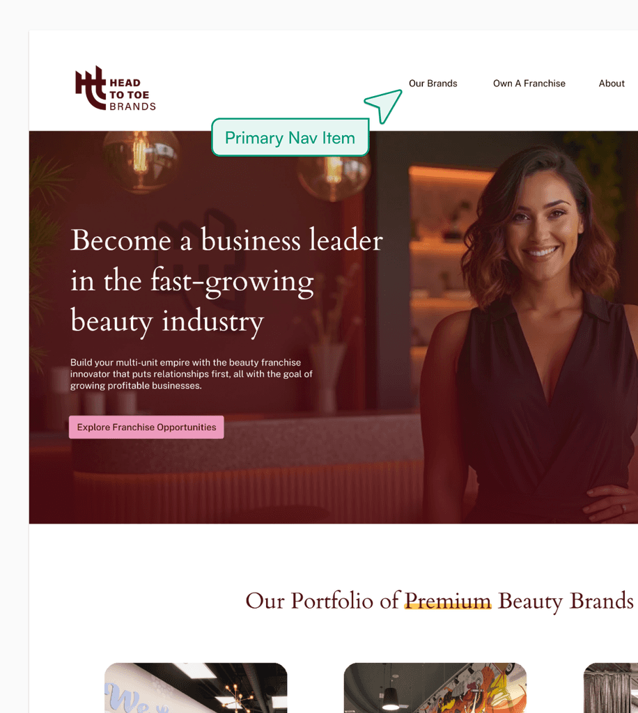
“Our Brands” was the top priority
Participants consistently looked for brand-level info first. I made “Our Brands” a primary nav item and designed it as a visual hub for exploring each franchise.
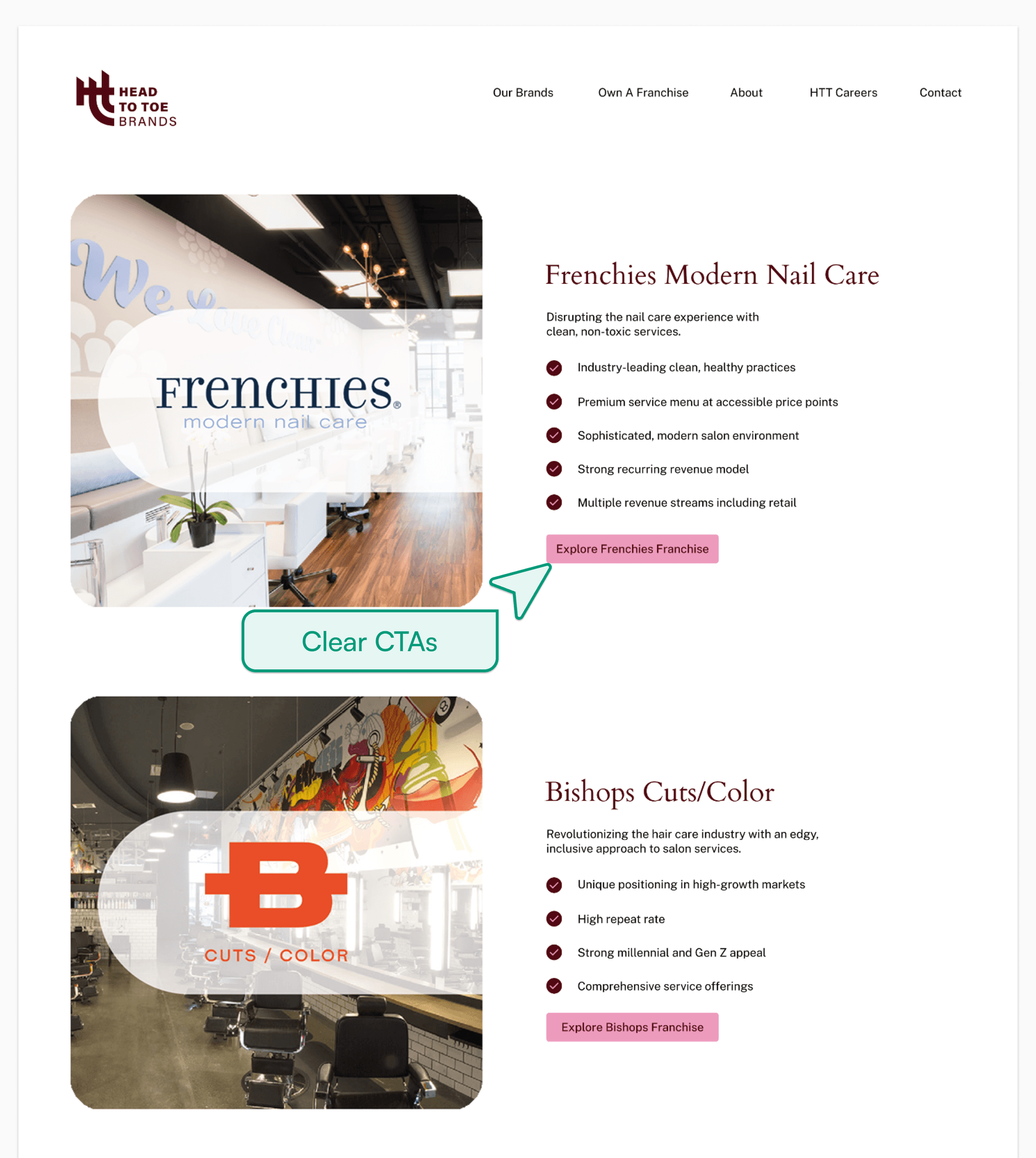
Brand sites needed clear entry points
Users wanted to move smoothly from portfolio-level overviews into individual brand sites. I used clear labels and CTAs to guide this transition without ambiguity.
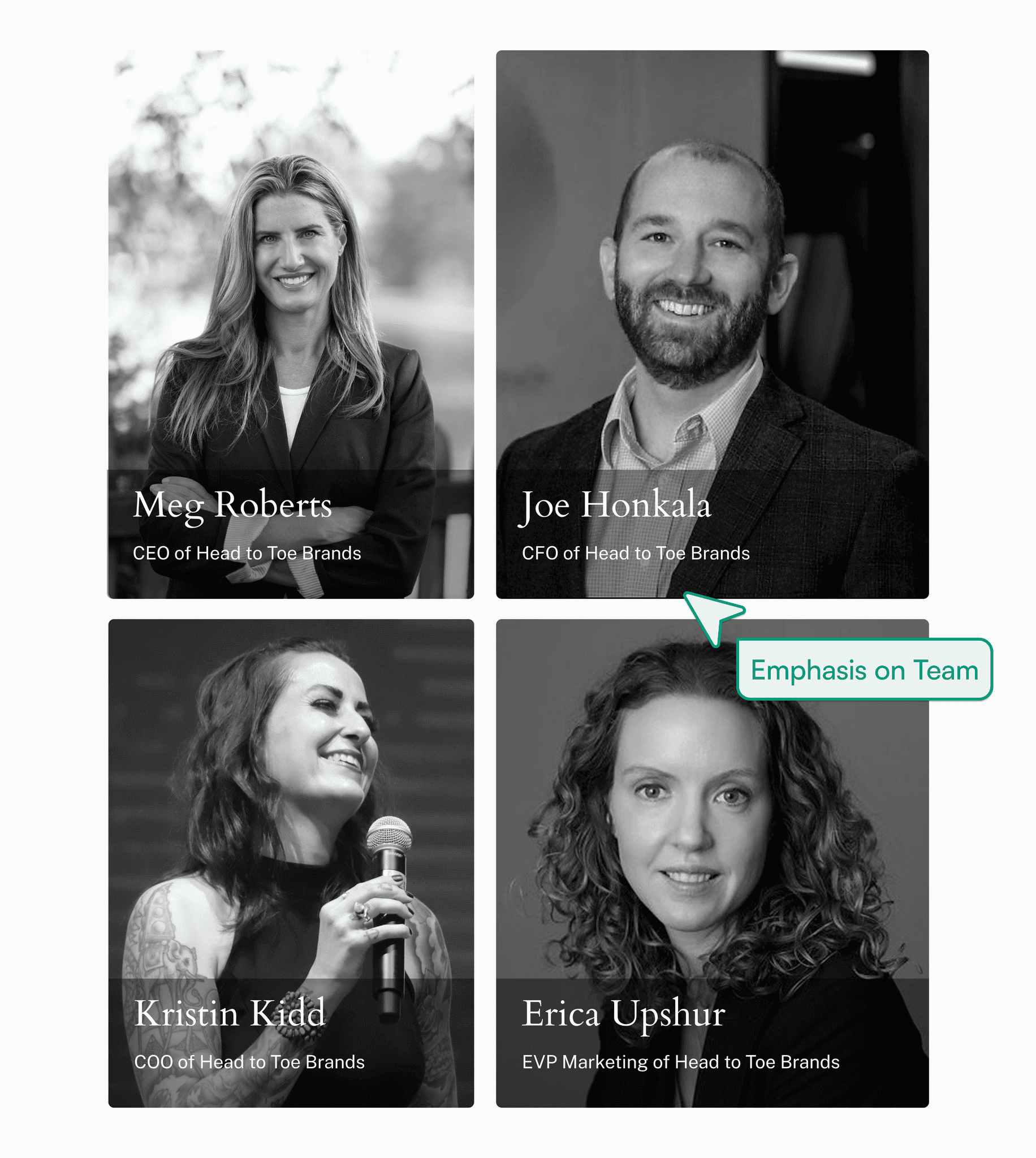
Trust came from story and leadership
Users were more confident when they saw who was behind the business. I prioritized team bios, brand history, and mission content to build trust across audiences.
Users needed to self-qualify early
Franchise prospects wanted to know upfront if they met the requirements. I prioritized eligibility content in the IA and added clear, early access to qualification details on key pages.
“Our Brands” was the top priority
Participants consistently looked for brand-level info first. I made “Our Brands” a primary nav item and designed it as a visual hub for exploring each franchise.
Brand sites needed clear entry points
Users wanted to move smoothly from portfolio-level overviews into individual brand sites. I used clear labels and CTAs to guide this transition without ambiguity.
Trust came from story and leadership
Users were more confident when they saw who was behind the business. I prioritized team bios, brand history, and mission content to build trust across audiences.
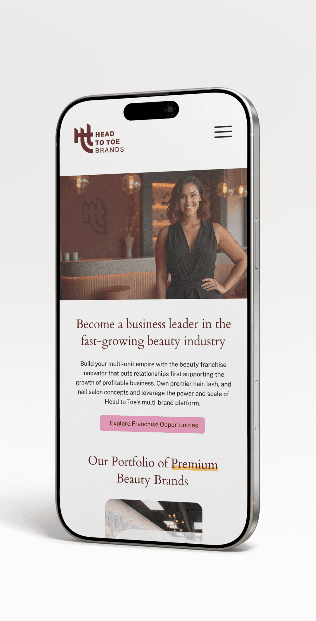
From wireframes to a modular design system, I developed and launched the site in WordPress
Following initial research and site architecture, I created wireframes to define the content hierarchy. Using the provided brand guidelines as a foundation, I created a modular design system focused on scalability and ease of use. Upon design approval, I built and launched the site in WordPress, allowing the internal marketing team to manage updates without relying on additional development resources.


Decisions made considering design constraints
01
Color & Type
I was limited to using the brand’s existing color palette and typography, with no flexibility to explore or propose visual alternatives.
01
Color & Type
I was limited to using the brand’s existing color palette and typography, with no flexibility to explore or propose visual alternatives.
01
Color & Type
I was limited to using the brand’s existing color palette and typography, with no flexibility to explore or propose visual alternatives.
01
Color & Type
I was limited to using the brand’s existing color palette and typography, with no flexibility to explore or propose visual alternatives.
02
Imagery
I proposed using authentic photography to engage franchise prospects, but AI-generated imagery was chosen to maintain internal preferences.
02
Imagery
I proposed using authentic photography to engage franchise prospects, but AI-generated imagery was chosen to maintain internal preferences.
02
Imagery
I proposed using authentic photography to engage franchise prospects, but AI-generated imagery was chosen to maintain internal preferences.
02
Imagery
I proposed using authentic photography to engage franchise prospects, but AI-generated imagery was chosen to maintain internal preferences.
01
UI Elements
The team selected the final component styling; I recommended stronger contrast on CTAs to support clarity and visual consistency across the system.
01
UI Elements
The team selected the final component styling; I recommended stronger contrast on CTAs to support clarity and visual consistency across the system.
01
UI Elements
The team selected the final component styling; I recommended stronger contrast on CTAs to support clarity and visual consistency across the system.
01
UI Elements
The team selected the final component styling; I recommended stronger contrast on CTAs to support clarity and visual consistency across the system.

The platform is now actively used to recruit franchisees and scale content
The site has been adopted by the client and integrated into their ongoing operations:
HubSpot lead forms route inquiries directly into brand-specific CRM pipelines
The internal team continues to update the site with new brand content as the portfolio grows
Leadership expressed strong satisfaction with the final product and its ease of use
It serves as the primary digital tool for franchise recruitment across three brands